Sunday, 28 December 2014

OOZN Design creates New Six Degrees Cafe in Jakarta

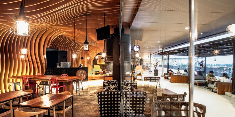
The derivation of the cafe name "6 Degrees" came from the "six degrees of separation" theory that everyone is six or fewer steps away from any other person in the world. The owner envision his cafe to be the meeting place for friends socialising over a good cup of coffee. The design brief was simple: to make the cafe memorable and cosy.


Situated inside a mall in Jakarta, 6 Degrees Cafe has a rectangular floor plan with a 16m long shopfront on the long side. The most visually impactful from the exterior was the ceiling and the rear wall, so we focused on it. We created an undulating skin of timber slats equally spaced apart at 150mm intervals which covers the entire wall and ceiling to break the monotony of spatial heights. Undulation of the veneer plywood were hand crafted by the local carpenters, meticulously following the unwrapped elevations drawn by us. Varying depth of the fins not only create a strong visual impact, they also hide the ceiling equipment and improve the acoustics inside the cafe. With music in the background and heavy flow of customers, individuals are still able to enjoy a chitchat over a nice cup of coffee.


The interior comprises four types of seating areas so the customer can choose the environment best suits their mood. A group of people who comes here to socialise can hang around the huge bar table; a person who needs a place to read a book or a couple who just want to have a quiet dinner can find their favourite spots.


Finishes were carefully chosen to create a cosy and relaxed ambience using natural materials & colours, including the selection of the furniture. Timber veneer slats matches the concrete screed floor to give a rustic touch. Warm timber and natural tones contrast with a dark interior paint provides an escape from the outside heat. Individual pendant lights hang over each table, floor recessed strip lights gives a soft illumination to the timber slats, providing just the right amount of luxe level to create a soothing ambience.


With evident amount of returning customers, we believe we have achieved the goal of making the cafe a memorable and cosy place for socialising over a nice cup of coffee.


2015 Color of the Year from Pantone... PANTONE 18-1438 Marsala

Now a little about coming year... The color experts at Pantone have debuted their 2015 Color of the Year dubbing the strong, warm color "Marsala". Described by Pantone as "a naturally robust and earthy wine red", the hue walks the line between a rustic brown and a bold berry. 


 This highly varietal shade combines dramatically with neutrals, including warmer taupes and grays. Because of its burnished undertones, sultry Marsala is highly compatible with amber, umber and golden yellows, greens in both turquoise and teal, and blues in the more vibrant range.


 Complex and full-bodied without overpowering, Marsala provides a unifying element for interior spaces. Add elegance to any room by incorporating this rich and welcoming hue in accent pieces, accessories and paint. Marsala’s plush characteristics are enhanced when the color is applied to textured surfaces, making it an ideal choice for rugs and upholstered living room furniture.


 Nurturing and fulfilling, Marsala is a natural fit for the kitchen and dining room – making it ideal for tabletop, small appliances and linens throughout the home. The hue will be especially prominent in striping and floral patterns found in printed placemats, dinnerware, bedding and throws.


 The Color of the Year selection requires careful consideration and, to arrive at the selection, Pantone combs the world looking for color influences. This can include the fashion and entertainment industries – including films that are in production, the world of art, popular travel destinations and other socio-economic conditions. Influences may also stem from technology, the availability of new textures and effects that impact color, and even upcoming sports events that capture worldwide attention.


Friday, 26 December 2014

Art Nouveau Interior Design

It has been said often that Art Nouveau interior design is in fact the original modern style of the 20th century, as it was the first style to stop looking back in time for inspiration.


Art Nouveau was influenced by ideas of the natural world and what designers experienced around them, borrowing ideas from nature and reflecting them in magnificent fabrics and wall paper.

From 1880 to 1910, art nouveau interior design was the height of originality and design excellence. The concept was first on show in Paris, France and then London, UK. It caused a huge fuss as people instantly loved it or loathed it.


The two distinct looks that were commonly used by nouveau artist are rational, linear lines and curves that take on organic shapes.

Take a look at the wonderful work created by the architect/designer Charles Rennie MacKintosh and his wife and fellow artist, Margaret MacDonald. I am very proud to be from the same city, Glasgow in bonnie Scotland.

Art nouveaus predecessor is the arts and crafts style, taking from it the shared love of beautifully hand crafted, quality goods of fine craftsmanship.

The look incorporates stylized flowers, leaves, buds and roots like those shown in the image below. The female form was widely used in the pre-Raphaelite pose with long, flowing hair. Art Deco was also influenced by those elements.


Exotic woods were designed into the incredible marquetry of Art Nouveau interiors and iridescent glass stunned buyers with its sumptuous look and dream like appeal. Lalique is a perfect example of this type of glass. 

Colors: soft, muted colors were often used so select from a palette assortment of sage and olive green, mustard yellows and brown. Pair those up with beautiful shades of lilac, violet and purple. Peacock blue is stunning against a white backdrop so do not be afraid to paint your walls in brilliant white or in an off-white shade.

Walls: you could select a magnificent wallpaper like that seen in the image above or in the below left bedroom, to act as a feature wall. There are incredible ranges to suit art nouveau interior design or why not just keep your walls white and elegant looking.


White or off white tiles interspersed with a patterned one would certainly add to the authenticity of your look.


Floors: should be parquet to resemble the floor finish of the marquetry that was often used. Keep the timber in natural mid tones or for a modern twist you could whitewash it with paint.


Decor: wasn't always simple, it was however decadent and ornamental. Take a look at the ensemble below.  Here we see a collection of necessary storage, developed into on piece. It has simple touches of design and staying true to this period it is warm in color and has a beautiful mix of curvy and straight lines flowing up either side. The organic look of art nouveau interior design always grows from the ground up.


Stained glass panels with curved leading that look like stalks and leaves really help to bring this concept to life. They were often used in doors as well as in furniture wardrobe doors, cabinets and mirrors. A mix of colorful glass and semi-precious stones can be used to really give a luxurious finish.


Chairs were more often tall like those you can see below. This helped to create intimate spaces within a room, allowing ladies to sit and chit chat without worry of their voices being carried across the room. They were usually finished in a glossy black lacquer and occasional had touches of a floral design in the upholstery fabrics.

Accessorize your finished room with a selection of ornaments in silver, pewter and opaque pearl glass. Look for frames that depict the look to house your artwork.


Lighting: no art nouveau interior design would be complete without a Tiffany lamp like the one shown below. Constructed from a bronze base the Tiffany lamps have an umbrella shaped shade, made from spectacularly, interesting stained glass. 

Art Deco Interior Design

It was around 1908 when Art Deco interior design began in Europe. Art Nouveau was at that time still popular however, Paris was changing and by the end of World War I in 1914, Art Deco was the popular choice and was the leading style until the end of the second World War in 1945.

By the 1930's, mass production of furniture and decor meant that art deco interior design was accessible to everyone.


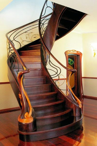
Art deco was influenced by the art nouveau's use of motifs depicting nature; sunrises, flowers and shells however, the once loved organically, flowing lines were replaced with geometric and angular shapes. However, curved lines were occasionally used like those in the art deco staircase above.


A fantastic example of art deco is the Chrysler Building in New York which is shown in the images below. Have a look at how shape was used to make up the stylized pattern.


Travel during the deco period became increasing popular, therefore global influences affected the art deco decor and color palette. Egyptian pyramids and sphinxes are commonly seen in art deco interior design and since African safaris were 'the thing' to do, animal skins and prints, ivory and mother of pearl were sought after.


Color: The most popular colors were glossy black, chrome, silver, yellow and red. You could also use cream, off whites, beige, oyster and shades of green.


The living room below is a stunning example of deco interiors. The colors, tones and slick style represent this arebeautifully. Classic and definitely tastefully put together.


Walls: Art deco is all about symmetry and balance which you could capture using wallpaper like those in the wonderful shown in the examples below. Using a wall covering with a bold pattern looks great on just one wall rather than all walls within the room. 


There are some fantastic deco images available in poster form, which make great artwork when framed and hung on smoothly, painted walls.


Mirrors were a big accessory during the deco period so either big or small would make a great contribution to a wall in your room.


Floors: Parquet wooden floors with a polished finish, similar to what is shown in the staircase image, would really pull your deco look together or you could select a linoleum with an abstract design. Black and white vinyl tiles were also a popular floor finish so perhaps introduce that look as a stunning feature.


You may consider adding a stylish, geometric patterned rug into your room which could help your designs come together and hold the room with a flare of a little something, something. However, the rug should be simple and not the star attraction.


Fireplace: Art Deco fireplaces were often constructed from concrete which unfortunately means that not many have survived today. The below images show an example of a polished cast iron fireplace which was a great addition to the deco home however it was expensive. The other is made of marble and has been cut to the design typical of the fashionable geometrical, linear look that represents this style.

British Interior Design

Adding a touch of British interior design into your home is a great way to make a style statement.


Typically and probably the best way to introduce "cool Britannia" into your British interior design concept, is to incorporate the flag, 'the Union Jack' into your design.


The image below shows an example of the flag painted onto the whole of a wall as a mural. This would work well within in a contemporary interior concept.


British interiors at home work when elements are added sparingly. For example, lets say you incorporated the above mural onto a wall in your home, then that would be enough. More than enough of a wow! -therefore, the rest of the decor would have to be pretty neutral to make it work.


The simplest way to get a touch of cool Britannia, is to look for a few really great scatter cushions. That way there is a suggestion of this concept.


Color: RED, WHITE and BLUE of course however, please do not literally cover your home in only those colors. Look for interesting ways to introduce them.


So let's think about this style for a moment and upon reflection what comes to your mind when you think of the United Kingdom? 


Yes the flag for sure but the Queen probably is another strong and significant 'British' symbol


There are many ways to give your home a feeling of being 'king of the castle' or 'queen or the manor' and the crown will work a treat every time.


The image on the right let's you see how an over-sized piece of art in monochromatic, black and white print can make quite an impression.


The image below is a great example of a vintage touch of patriotism using big, bold items. Observe the color palette here and note how harmonious each interacts within the space. Overall this dining space could also be used for study and for business meetings.


Again, I've added a vintage shot to show you how grand gestures like the tennis rackets can be a wonderful and unique way to style a room. This living room is quirky however it remains formal and has been designed with sophistication according to the dynamics of what this space can hold.


Another great way to get with this concept, is to create a funky bedroom. The easiest route is choose a fantastic UK styled bed throw or quilt cover for your bedroom similar to that which you can see in the below, left image or add a rug similar to the example shown in the below, right teen bedroom. I am sure the teen occupant loves their super cool refrigerator! What a great and fun addition that is.


The bedroom below is off the scale in design. Look at how the room has be utilized to max the space available. Uber cool bedroom. The hard finishes are perfectly balanced out with the addition of the giant sized, soft flowing British flag bed throw


Shabby Chic Interiors

So here you are at the Shabby Chic interiors section where the aim is to help you create your own version of this style which is well known to be commonly mixed with an interesting ensemble of interiors, and is indeed a very well used English look that is both warm and charming.

To understand what this concept is firstly it's good to know that it was a phrase branded by the then film stylist, Rachel Ashwell who went on to own her self built 'Shabby Chic' business.

The decor is worn, pre-used or rather a pre-loved mix of vintage objects and furniture of beauty and imperfection and it is that, which makes this style of comfort work.

The partial view of a living room in the image below, shows how bold color can be used within neutral surroundings.


Shabby Chic style is about creating a bohemian, laid-back environment for your family to enjoy. Forget about twee and fussy, this look is relaxed and comforting.

Decor: the bigger the sofa the better! Exaggerated sofas with washable slipcovers are the host of this concept. Essentially you could accessorize the look with secondhand, flea-market furniture and objects which make this style very relevant in today's economy.

The images below show an example of a perfect 'shabby chic' style sofa and an incredible, distressed finished bookcase.


Look for furniture that has layers of paint on it with purposely worn spots which create an antique effect or vintage style pieces painted in soft pastels or white, mint greens or sort aqua blues which work to pull the character of this concept together.

Almost any type of wooden furniture could be transformed to fit into shabby chic interiors, if it is painted white. To do this you could apply paint with brushes or use a spray paint, then sand down some areas, particularly the corners to rough it up a little.


Color: Soft white, pale pink, mint green, light grey all make up a fantastic shabby chic style color palette.


The bedroom shown in the below, left image is a great example of how to get the mix and match look going in your home and the set of drawers which you can see in the right image below are distressed finished and they almost blend with the backdrop wallpaper and accessories.

Accessories: What you are trying to do is get the balance right between elegant things with the old and worn.

Shiny silver accessories look fantastic placed on top of painted wooden tables and go for soft throw rugs that are finished in dreamy soft floral patterns and rough old lace.


Wrought iron curtain rods with sheer curtains look really great and help add to your room.

A great addition to your space is to add freshly cut flowers into a beautiful vase and let soft scented candles and aromas fill your hallway. It creates an inviting and memorable atmosphere to your home.

You'll be amazed how interesting your home becomes as you work through this concept.


The image below shows an example of a shabby chic dining area within a wonderfully, modern kitchen.

Monday, 22 December 2014

Contemporary Interior Design

Contemporary interior design is an exciting, collective celebration of what is current and new. The look is definitely modern with interesting clean, angular, curved lines holding the space together.

Despite contemporary design being 'new and current' their is also the love of what is popular and the respect of design classic furniture and objects like the timeless Barcelona Chair which you can see in the image below.


The contemporary concept is one of my favorite design styles. The majority of my projects are often based on a fusion of contemporary interior design. I get a lot of satisfaction from creating sensational rooms fused with a blend of contemporary design ideas, and lets say classical French interiors or colonial design. The mix truly looks fantastic.

My priorities lie with my clients dreams and their brief. Seeing joy at the end of a project, overwhelms me with such a deep sense of fulfillment.

The living room below is an inspiring fusion of contemporary Moroccan interior design and industrial interiors. A real modern boho look.


The end result should reflect all of your unique and wonderful ideas, so create an inspiring home that you simply love to be in.

Color: the immediate suggestion would be pure white like what has been used in the image of the room at the top of the page however, contemporary interior design is much, much broader and pretty much takes on the full color spectrum when applied tastefully. An example of using colour is shown in the image below. A neutral color palette would work very well to create your look with emphasis on colorful furniture, objects and artwork.


Walls: stay away from busy walls with fussy wallpaper. Keep your walls 'basic', best to choose flat painted with some fabulous artwork.


Floors: Anything from a simple carpet of one color to a polished concrete floor would work well. Equally a wooden or laminate floor finish would look awesome. Just remember that this look is about 'simplicity'. The flooring in image below looks great and perfectly shows a mix of contemporary and traditional interior design.


Decor: there are many, very well designed pieces of contemporary furniture available to add to your room(s). Some objects are designed using bold color so perhaps you could look for an exciting item similar to what is shown below.


Keep your spaces uncluttered so that each item can be viewed within its own space. Items made from wood, glass, chrome and metal will work really well in your scheme but stay clear of over embellishment or heavily ornate objects.

If your walls are a smooth, flat finish, try introducing a few interesting scatter cushions as that will help bring some texture into your space. It is important to keep the balance of your room when combining color and finishes so your design harmonizes.


Contemporary design ideas are constantly evolving, so you may introduce alternative accessories which would update your concept at a later date.